Introduction
Project Overview
This case study explores my process in redesigning the user interface (UI) and structural design of the support page for Dealmaker, a challenge that demonstrated my design capabilities but also led to my hiring at the company.
Company Overview
What is Dealmaker?
Dealmaker is a Shopify like storefront for businesses to manage investments & crowdfunding.
.png) Through Dealmaker's platform, an NFL team seeking funds to fix their stadium was able to manage the share offering and legal process allowing fans to support the team's new stadium in return for shares.
Through Dealmaker's platform, an NFL team seeking funds to fix their stadium was able to manage the share offering and legal process allowing fans to support the team's new stadium in return for shares. Link to the article here
More Information About Dealmaker
The earliest time you can invest in a company and receive shares is usually during an IPO, unless you fall under specific circumstances such as having a million dollars in the bank.
Enter Dealmaker, a company that opens up the ability to invest and support organizations or businesses and lowering the barrier to entry for the process. Through this process Dealmaker manages different raise types such as Reg CF & Reg A+ or provides services such as being the broker dealer for licensed jurisdictions in Canada and the US.
Created by two lawyers who specialize in financial law, it simplifies this process and acts as a cloud intermediary for the business and an investor. Letting investors and supporters order securities as quickly as ordering a pizza instead of weeks of legal work.
Now that you understand the company we can begin to dive into who exactly the users are with a bit more context.
Dealmaker's Users
The Investor & The Issuer
Who are the users?
This project currently focuses on the Investor. However, Dealmaker has 2 distinct user groups.
Dealmaker acts as an intermediary for its 2 distinct users user groups: the businesses using the Dealmaker platform and those investing or supporting businesses via Dealmaker and managing their shares through the platform.
On the B2B side, this would be CEOs, CFOs or legal teams. These would be the individuals directly acting in the investment deal or doing Investor Relations & Marketing for the firm. This group of individuals would be more familiar with the process due to a direct relationship with Dealmaker. If we return to the Shopify storefront example, the seller possesses an informational advantage over the buyer in terms of understanding the relevant terminology and key concepts. In this situation, we would would potentially need to adjust our language used as well.
Primary User: The Investor


Alex Thompson
29 - Software Developer - New York, New York
"Investing, to me, means understanding a company inside and out and experiencing their products firsthand. I enjoy trying out the latest innovations and invest in those I believe can make a significant impact. Before committing, I thoroughly research every aspect of a company to make informed decisions and hedge my bets wisely."
User Source
A security company that Alex raves about was looking for an alternative route to funding via the users.
Investment Preferences
Alex prefers a hands-on approach to his investments, favoring stocks in companies he believes in. His strategy combines tech-savviness with an approach to diversification, allowing him to make targeted choices rather than relying on index funds.
Platform Experience
Robinhood, eTrade, SeedInvest, Coinbase and Huobi
Michelle Rivera
42 - HR Manager - Toronto, Ontario
"When it comes to investing my hard-earned money, I prefer knowing exactly where it's going and when I get what I paid for. If I'm invited to invest in companies, I need clear, accessible information before making a commitment. It's not just about growing wealth; it's about smart, secure investments."
User Source
An HR Platform that Michelle frequently uses was looking for an alternative route to funding via the users.
Investment Preference
Michelle takes a conservative stance, focusing on safeguarding her family's future with index funds and guaranteed investments, prioritizing stability and security over high-risk, high-reward venture
Platform Experience
TD Bank, Wealthsimple, and Questrade
Robert Kim
60 - Retired Engineer - Miami, Florida
"After years in engineering, I've turned my focus to managing my family's investment portfolio. I have previously invested via Dealmaker and conduct local investment through the platform. I'm interested in straightforward investment opportunities with a clear value proposition and minimal risk that I have a stake in."
User Source
Uses Dealmaker to invest in warrants & shares and has previously invested via Dealmaker
Investment Preference
Robert applies a methodical strategy to investment, blending traditional portfolio management with a personal touch by advising local Miami companies, leveraging his expertise for steady growth
Platform Experience
Charles Schwab, Local Investments and Dealmaker
Samira Abdi
34 - Event Coordinator - Arlington, VA
"For me, investing is about more than just returns; it's a way to support the businesses and causes that resonate with me. Whether it's a community initiative or a local enterprise, I'm passionate about contributing to their success and being part of something meaningful and more tangible."
User Source
Using Dealmaker to help fund a local organization that supports the community.
Investment Preferences
Samira seeks to make a difference through her investments in a business, choosing to support businesses and causes with a significant impact on her community, a passion-driven approach to investing that goes beyond mere financial returns.
Platform Experience
Kickstarter, GoFundMe, Robinhood and
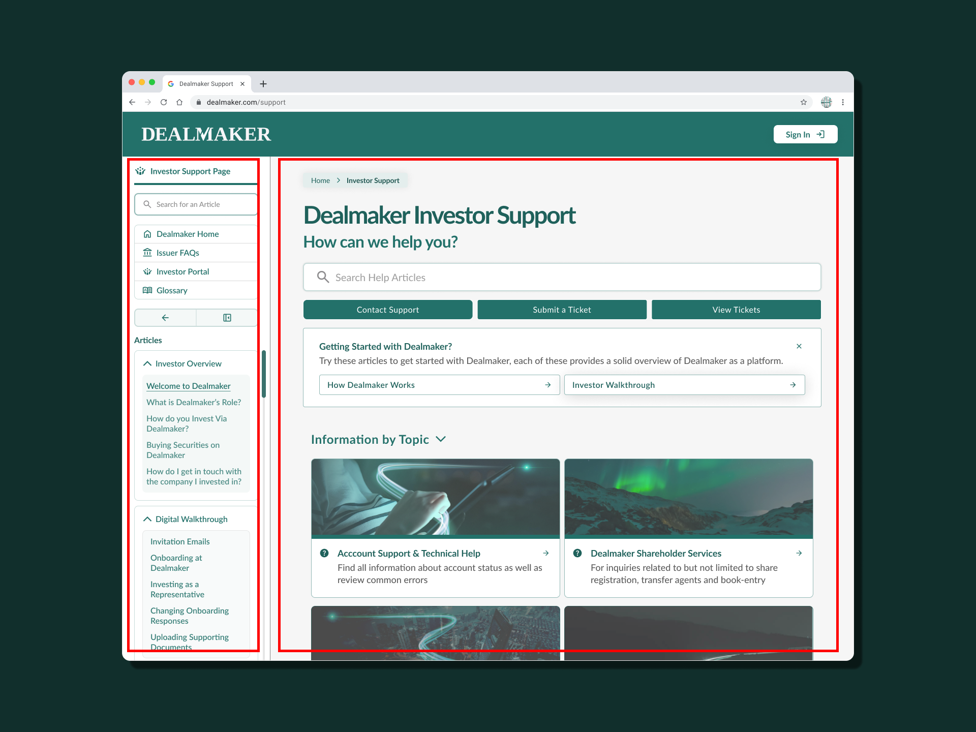
What are Investors looking for on the support page?


Furthermore we need to think about how some of these different requirements come across to users. These are all different things that I kept in mind after understanding the users.
Exploring the Current State
What can we learn from the User Interface?
Exploring the UI with user requirements in mind helps us better understand the user flow we'd like to reach. We can then use these findings to address tangible how might we questions
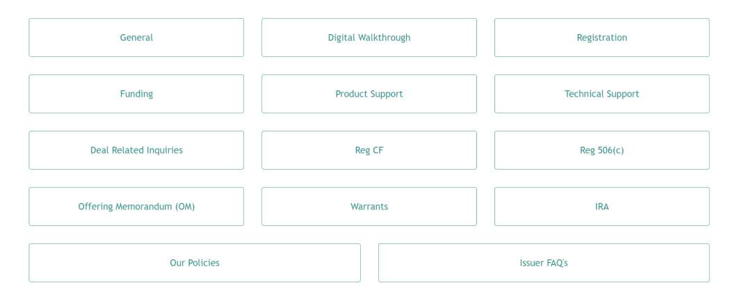
Landing Page
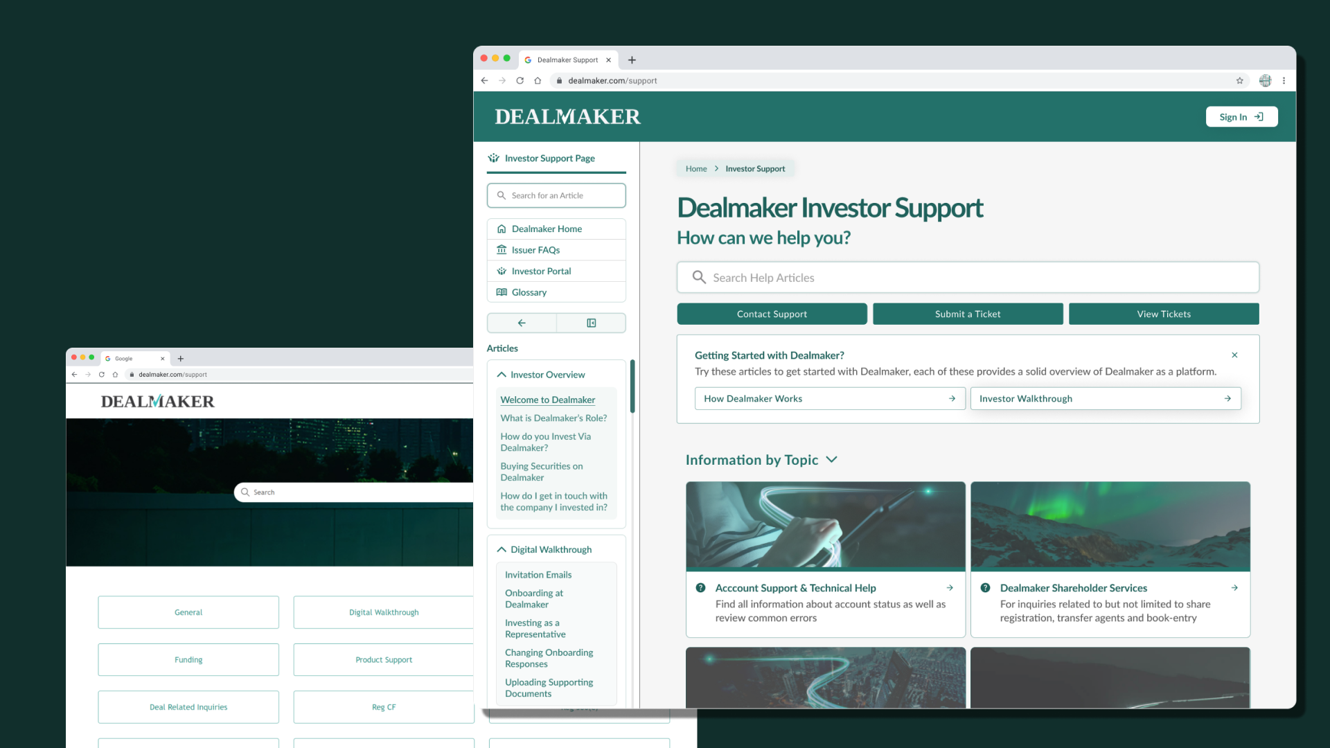
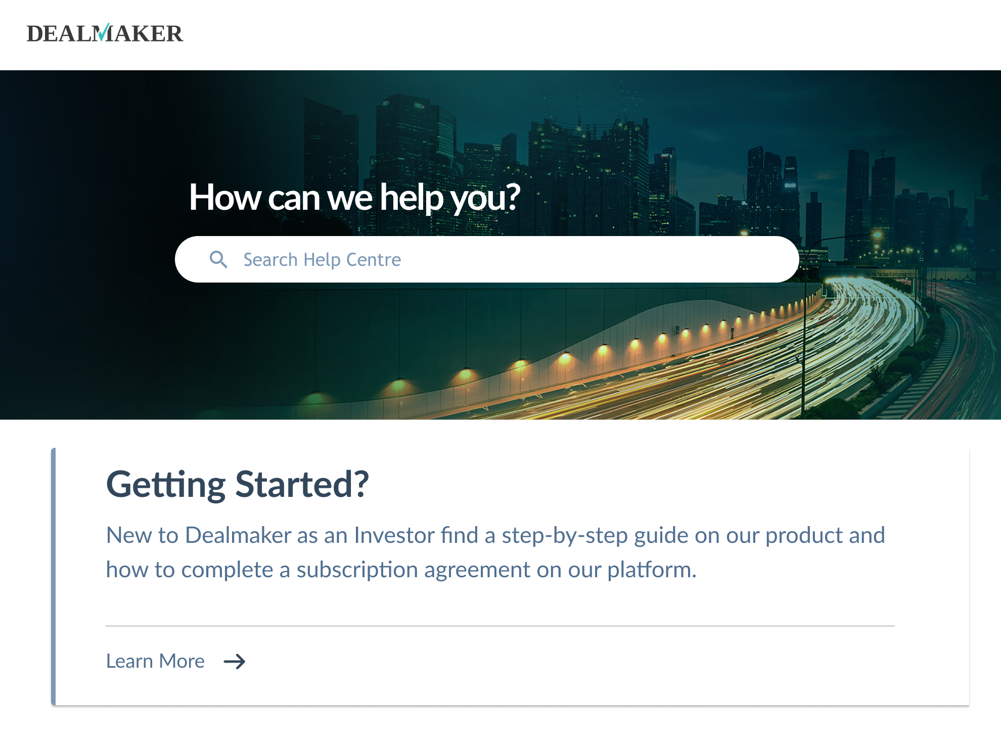
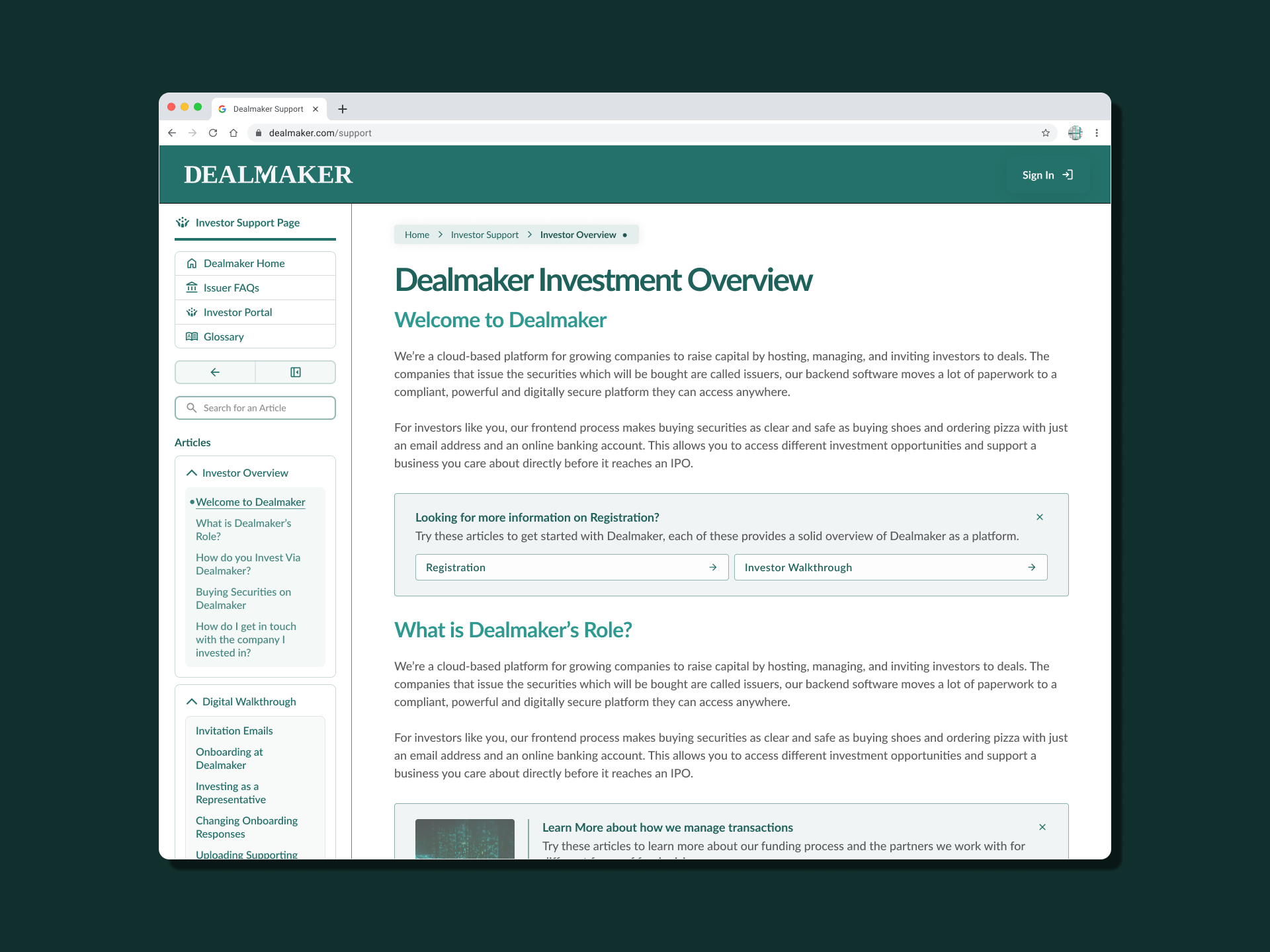
.png) The landing page for Investor support starts off with a Zendesk template support page.
The landing page for Investor support starts off with a Zendesk template support page.
One of the biggest problems is the lack of information and direction for the user. We're missing a clear hierarchy and navigation guidance. Even with this aspect ratio, you're probably squinting to see it 🔬. This is the first page a user is landing on when looking for support with a problem.
Cognitive Load & Applying Visual Hierarchy to Lower ComplexityWe can begin to approach this with ideas about improving the hierarchy. As you can see a pretty uniform button set. We're lacking a hierarchy to guide the user throughout the page here and they're coming in with a problem and no idea how to fix it. You can also imagine the user's cognitive load trying to understand what their problem is from here.
 A zoomed in photo of the Dealmaker Landing Buttons.
Handling investments and having complex terminology while lacking context and a distinct visual guide. Would increase the complexity of navigating, and that can provide us direction for improvements. We'd want to lower things like complexity to ensure we're on the right side of Hick's law.
Based on these we can note the potential of adding more context to the page, as well as work on the contrast & the colour scheme to improve legibility.
Categories & Articles Pages
Both of these pages share some of the same issues we've seen on the home page, indicating that the style issues weren't limited to the home page. There is a lack of ideal colour usage for contrast as well as missing context on a few of the evaluated pages.
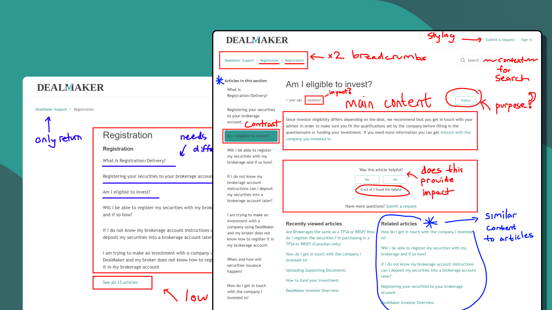 I took some time to go through the different content and evaluate and different page flows. Screenshots and a pen on Figma come in handy for the review.
For example, in the eligibility to invest page, found above, I don't think the user would be satisfied with the above. With limited information, if they haven't chosen the correct page their only solution would be to continue clicking through these options.
There might be an opportunity to evaluate the content grouping, as well as condense the information provided on articles. "Do we truly need a page for under 400 characters?", this question can help us flatten the architecture based on the stakeholder response. As well as condense related articles into a better content grouping.
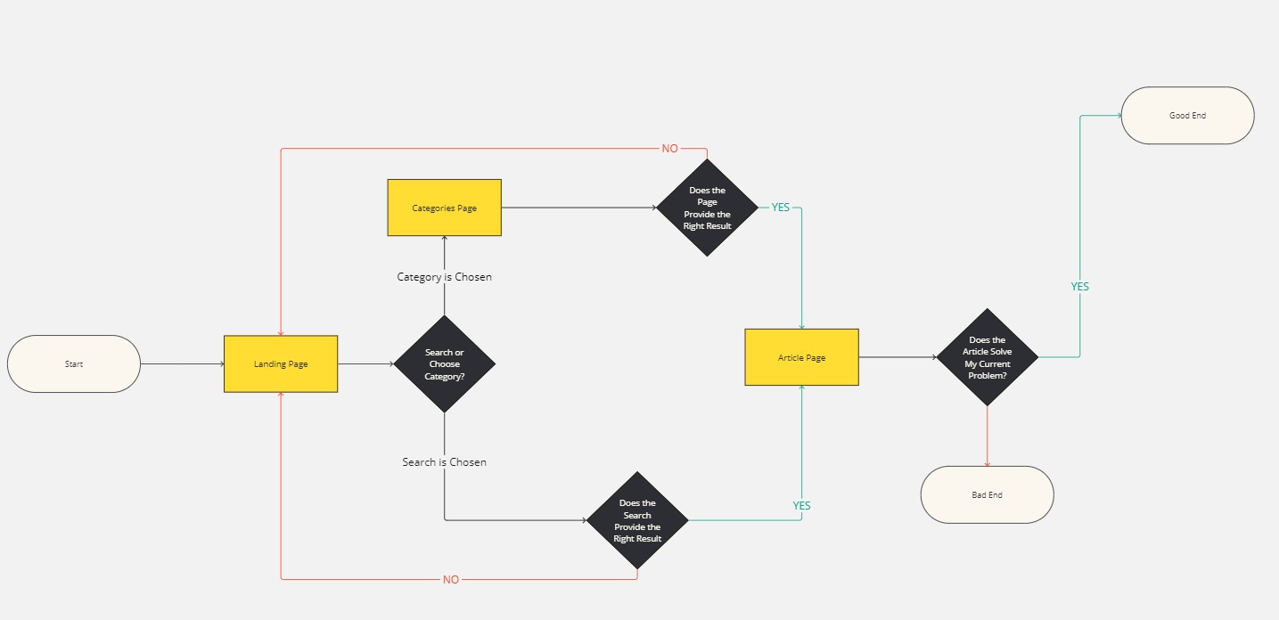
When taking a look at the user flow, we notice that for a user to navigate through the categories. There are a few more hoops to jump through, and each bad search results in them landing back to the very sparse categories page. Helping validate our hypothesis regarding the search path vs. the categories option.
 I took some time to go through the different content and evaluate different page flows
Furthermore, there are parts of the page we can repurpose such as related articles. We can potentially include previews for potential sub-headings within the articles.
For specific articles, such as the one shown we can also identify that there is a lack of content, which will definitely impact a user's experience as they would have to return to the categories page or the home page and repeat the process.
How to improve Contrast & ColourFor improving Contrast, I'd use tools to check the legibility of the fonts with different backings. There would be tools like Coolors.co or WebAIM's Contrast Checker ensuring we atleast meet an AA rating. Although each of the following colours fall in that rating (3.46 to 13.95), we'll try and use the darker shades to improve contrast
What I learned from the UI
A few of the things i was thinking aboutProblem Solving
What exactly are we solving for here and what is the scope?
With what we've learned the problems we're solving are the lack of context and guidance which will improve user experience as they can better navigate the page structure.
Problems
I tried to order these problems in terms of high-priority, to medium and low. As certain changes might require more of an in-depth content revamp.
We can add more context as previously mentioned, and fill in the gaps for the user. This will allow individuals to more easily navigate without frustration because of the reduced complexity. But what does this look like specifically?
We need to accommodate both experienced users like Robert, who may be more lenient with issues due to their history with Dealmaker, and new users like Michelle, who may be more hesitant due to their familiarity with traditional platforms
Can we potentially flatten the architecture and layout to make it easier for users to discover solutions to their problems.
When looking at other established support pages, what can we borrow to improve the experience of users.

Some of our users had a bit of trouble with the visibility. We can potentially improve the colour and contrast to make navigating a bit easier.
Wireframing
Working through the layout
I went through a lot of stages of wireframes, and progressively improved upon them. Some of these issues would have been solved with improved process, but it was a learning experience.
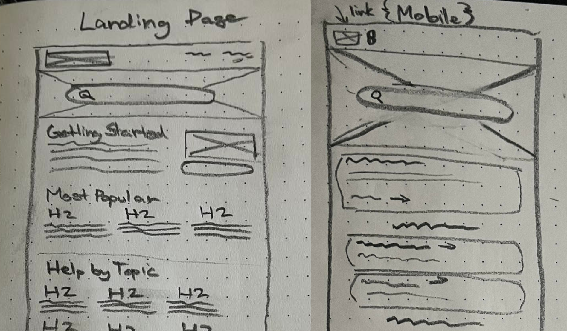
Addressing Context
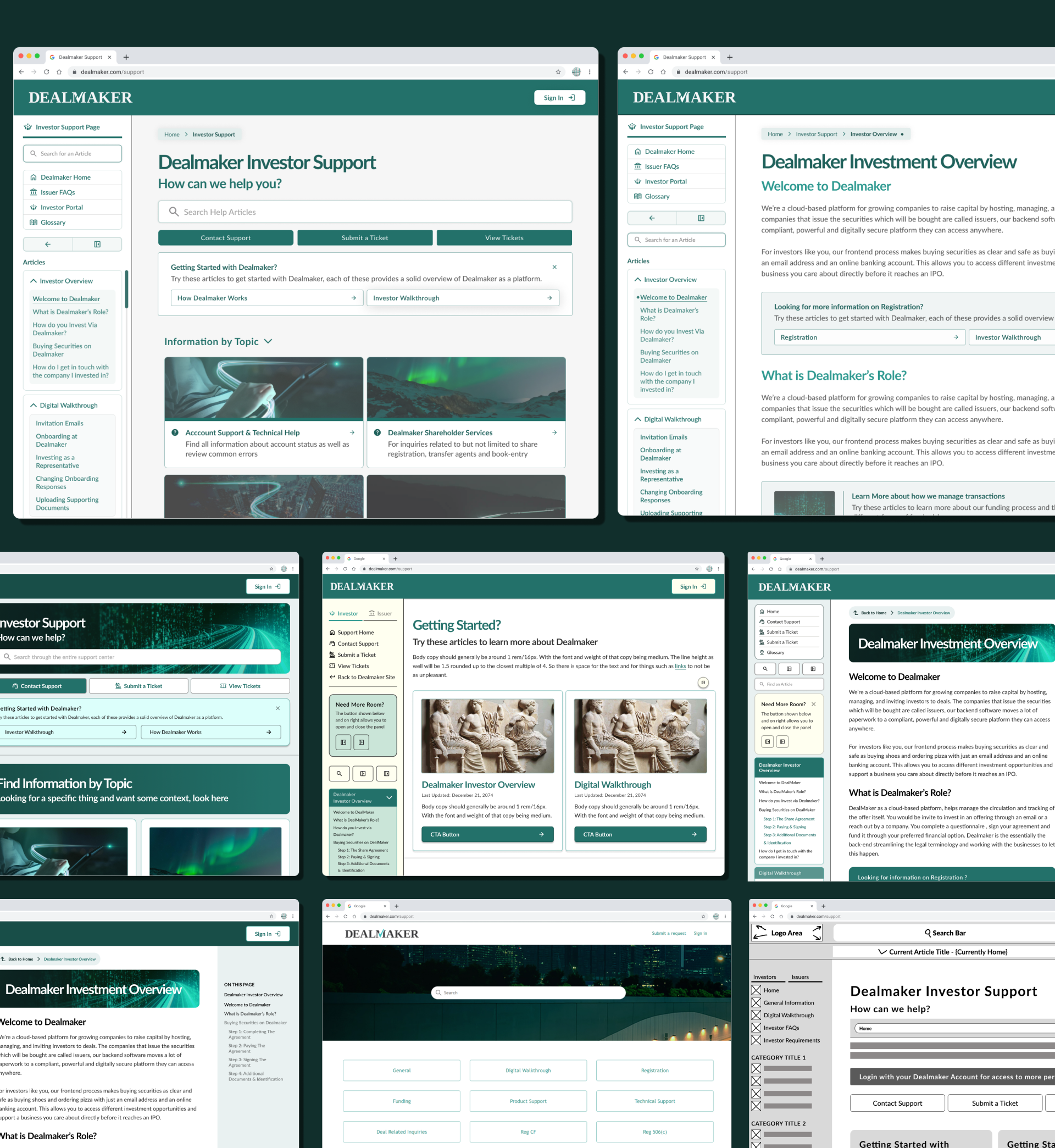
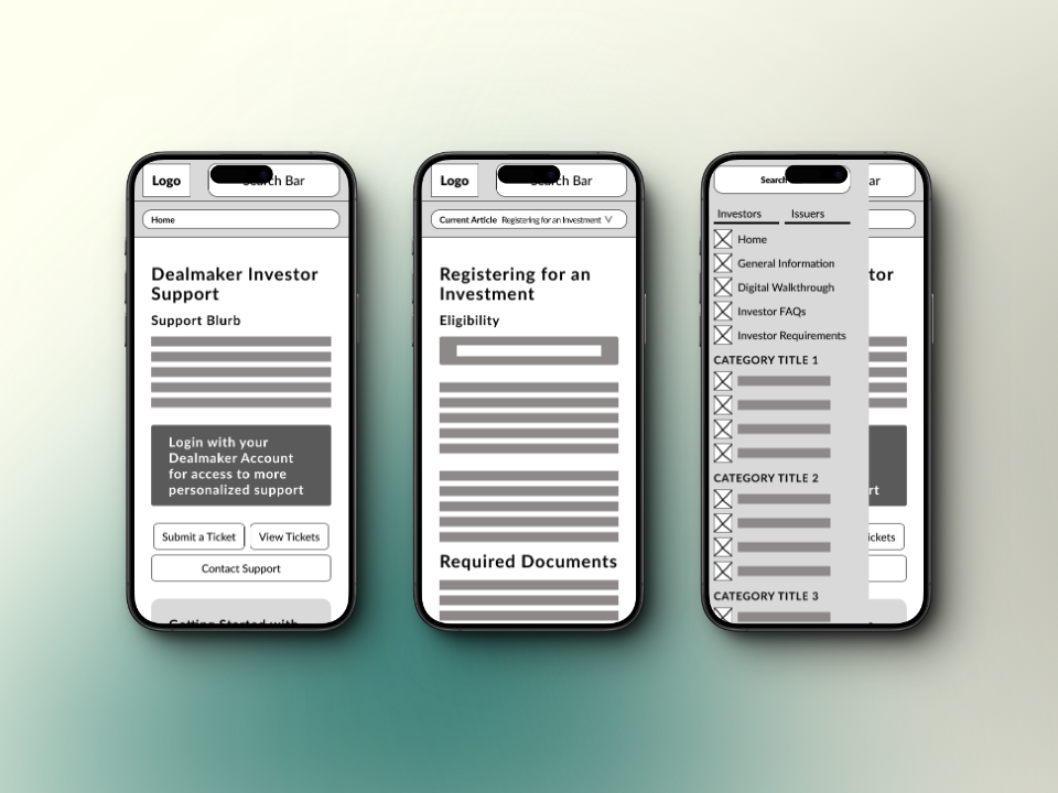
The first version of my mock-ups started on pen & paper. I tried to focus on thinking about areas to add in context. As well as setting up a stacked layout for mobile as seen on the right. We leaned on the initial layout for some inspiration, while adding cards to provide context for the user throughout navigation.
First Prototype
I had initially ran straight into the prototypes with the home page after the lofi mocks. However, I wasn't quite happy with how it approached the problem and I took some time to review that.
 It still didn't address the speed for the user to go through the flow. Nor did it feel as though it was the best solution. How it would provide a quick and easy improvement to one of the problems. You can also probably notice some issues involving font-sizing & spacing/consistency.
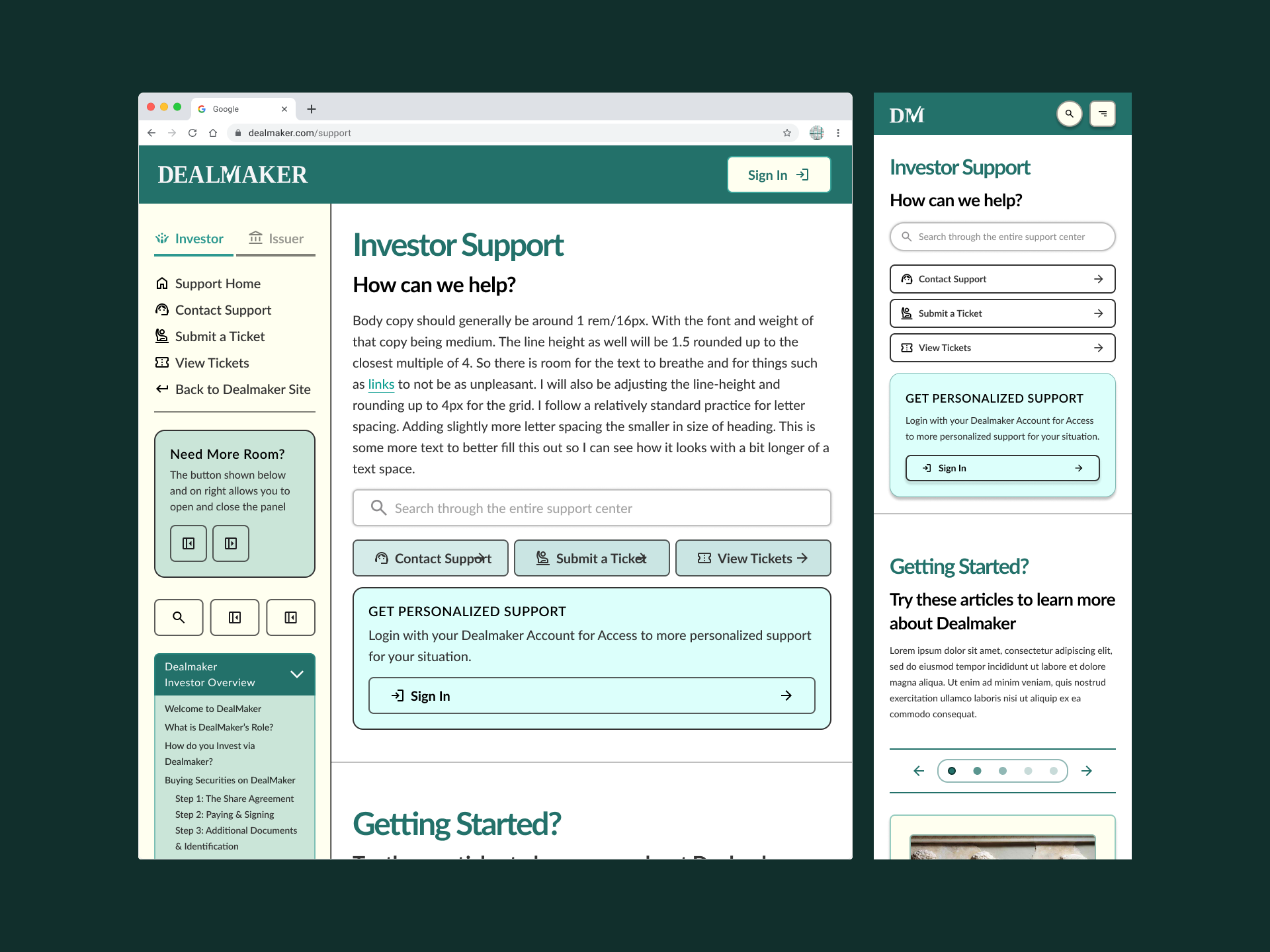
Improving the Wireframes
I wanted to find a specific solution that would help with navigating the different pages. I began taking inspiration from a lot of the documentation that I had been working with lately. As well as evaluating other large support pages to provide a bit of inspiration.
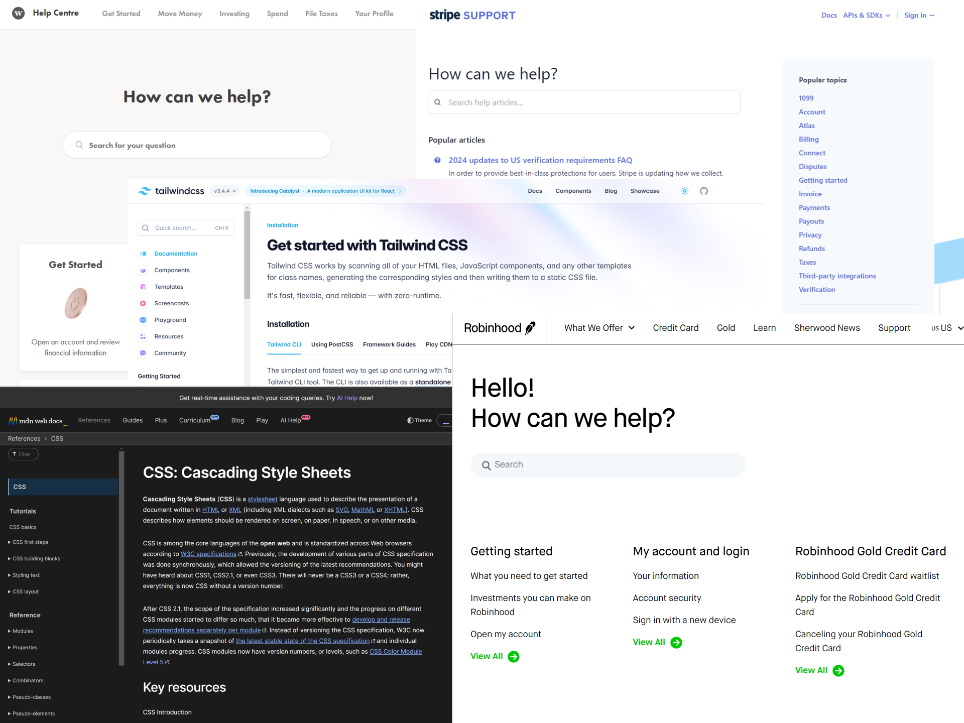 Most of the different pages have specific landings, with a description for the search bar which we've identified.
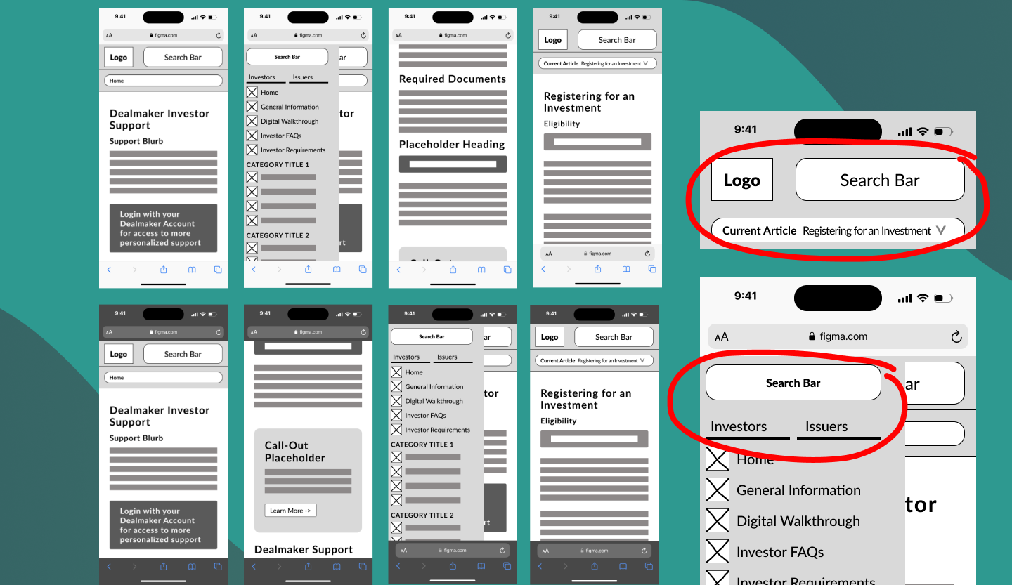
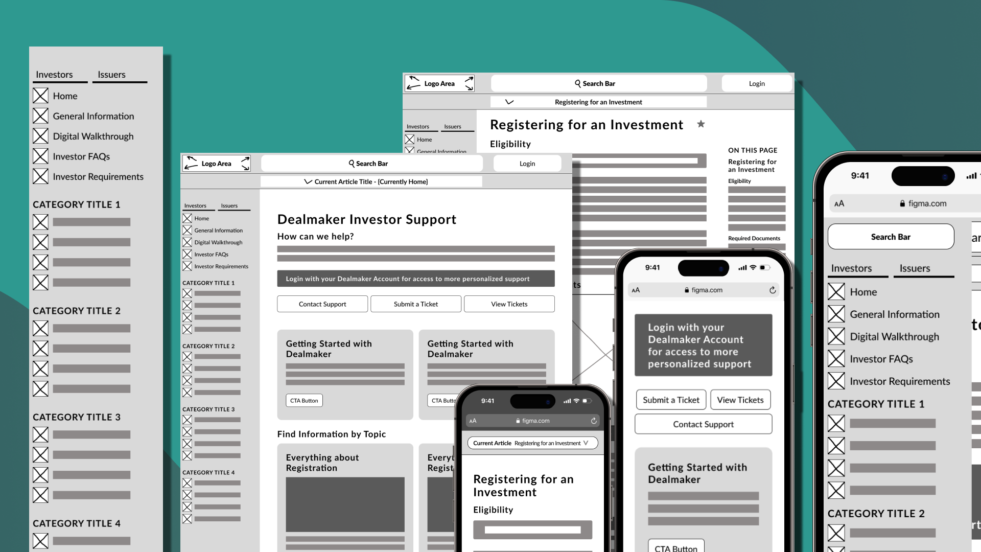
I began experimenting with what these sorts of layouts would look like. As well as thinking through the implementation on platforms like Mobile. This lead to a sidebar which improves navigational speed for the user. By making content more easily accessible.As well as a potential in page table of contents on the right hand side of articles on desktop.
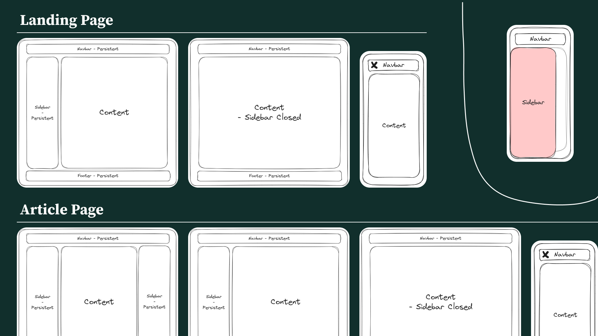 My attempts at a fusion of a documentation & support page, as well as experimentating with the sidebar on mobile.
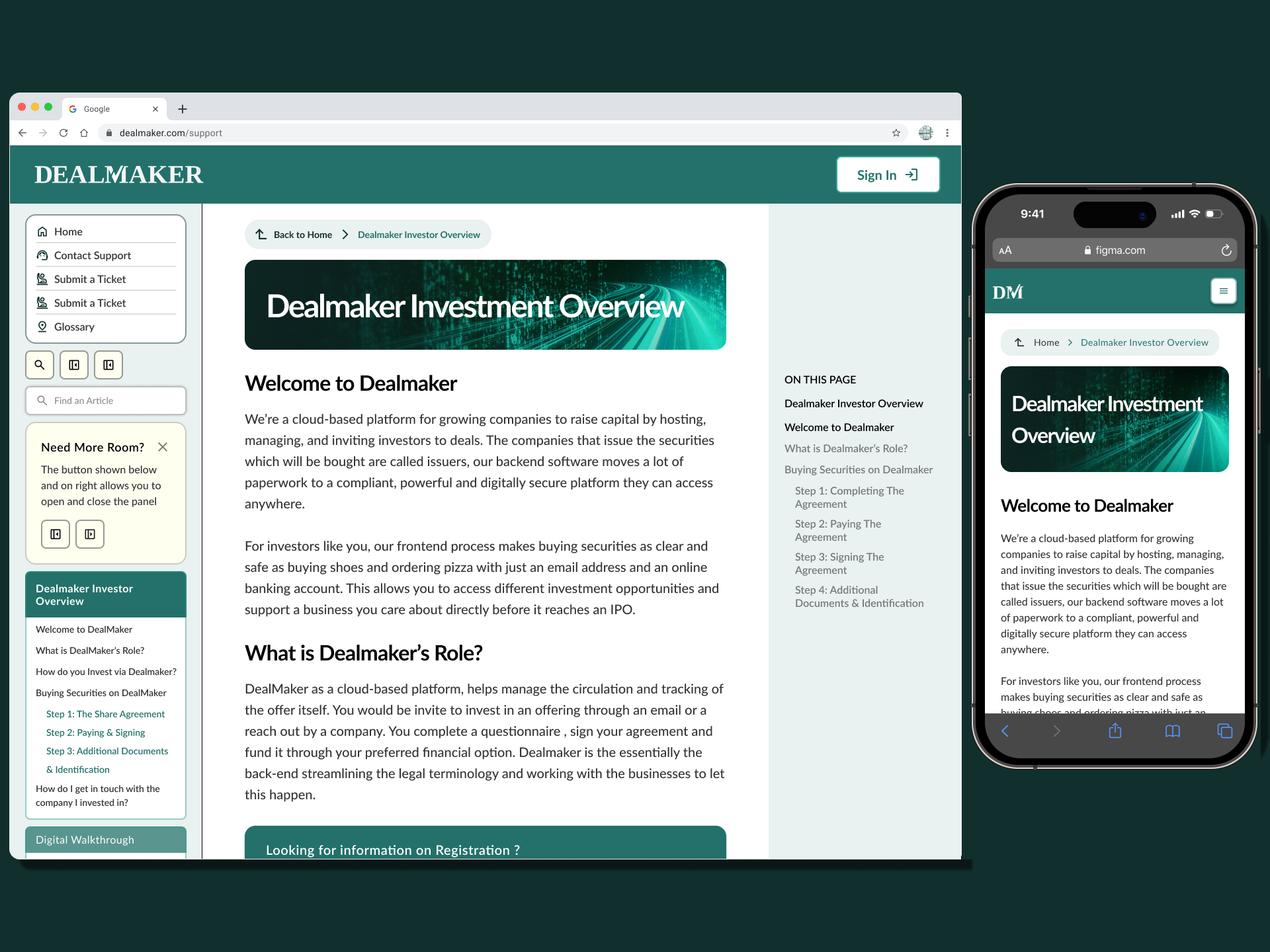
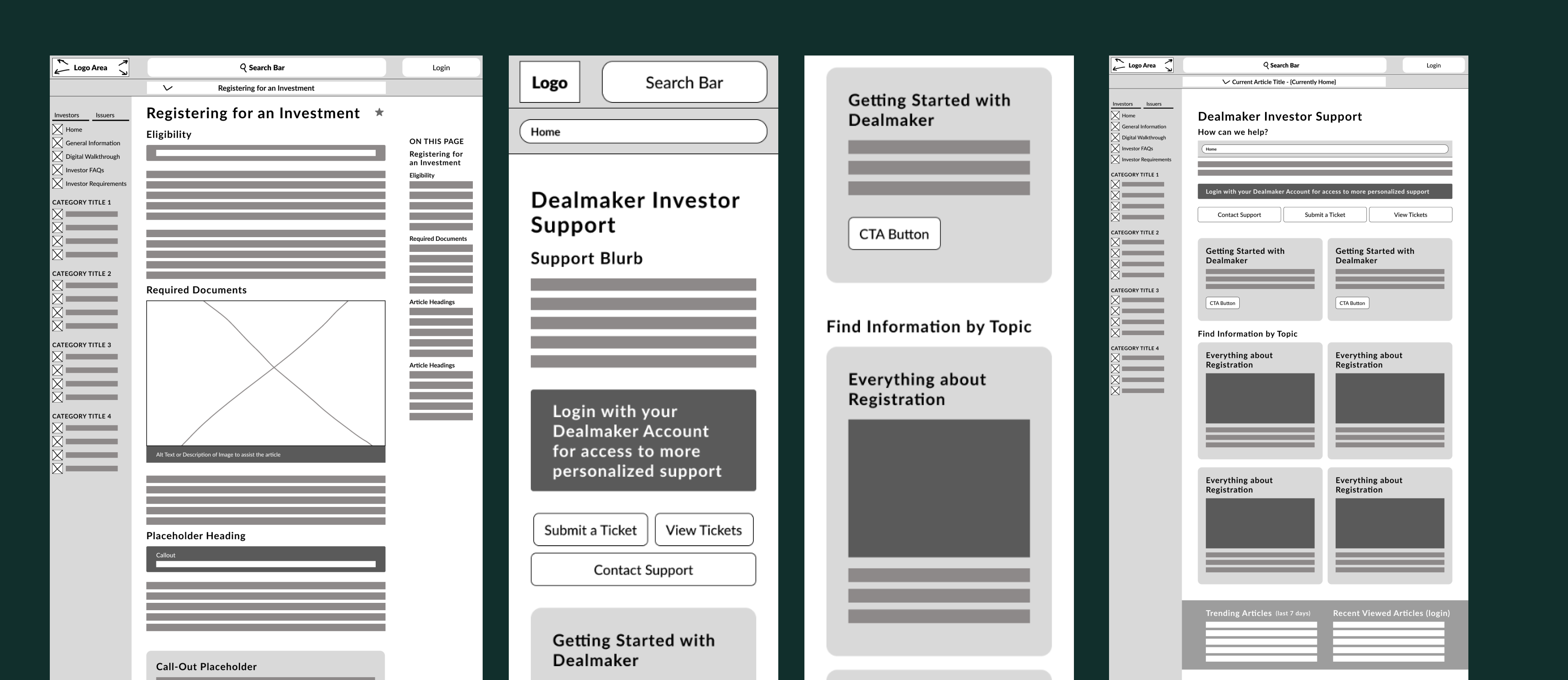 You can see this fleshed out a little more after I took it to Figma and worked with the spacing a bit more.
With this current layout we can take advantage of some of the mental models around documentation and support pages more easily. This is because we're able to provide a more easily navigable layout and potentially decreasing the total amount of area we need to cover by reducing the page contents and organizing them more effectively.
Issues in The Process
 When working with a format like this, with the desktop focus I have, we might completely overlook the phone functionality. Situations like this can occur if you aren't thorough in the design process.
 I made sure to fit against the mobile models to iron out any of these rookie mistakes in the wireframes
What does this format solve?
The space provided for the different headings will allow users to get a better understanding of the different topics on the support page. This will in turn lower the complexity of navigating the product.
This flattened architecture will allow users to more quickly reach different articles and will still be useful missing a content audit. As individuals can see all the different topics at a glance under the category titles. As well as including a better information architecture, to provide more guidance to the user's navigation.
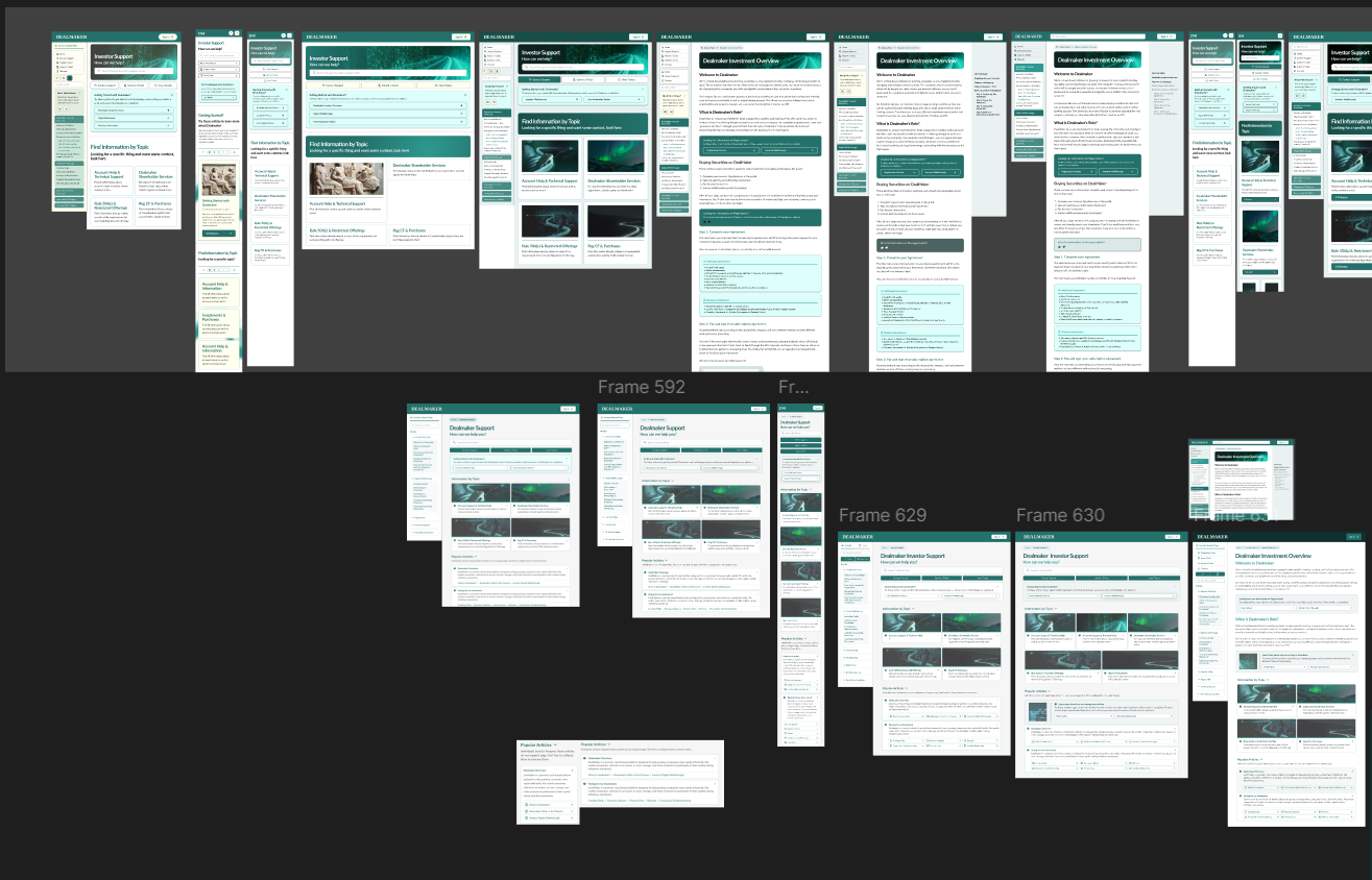
 I focused on different iterations of optimizing the layout for the support page itself.
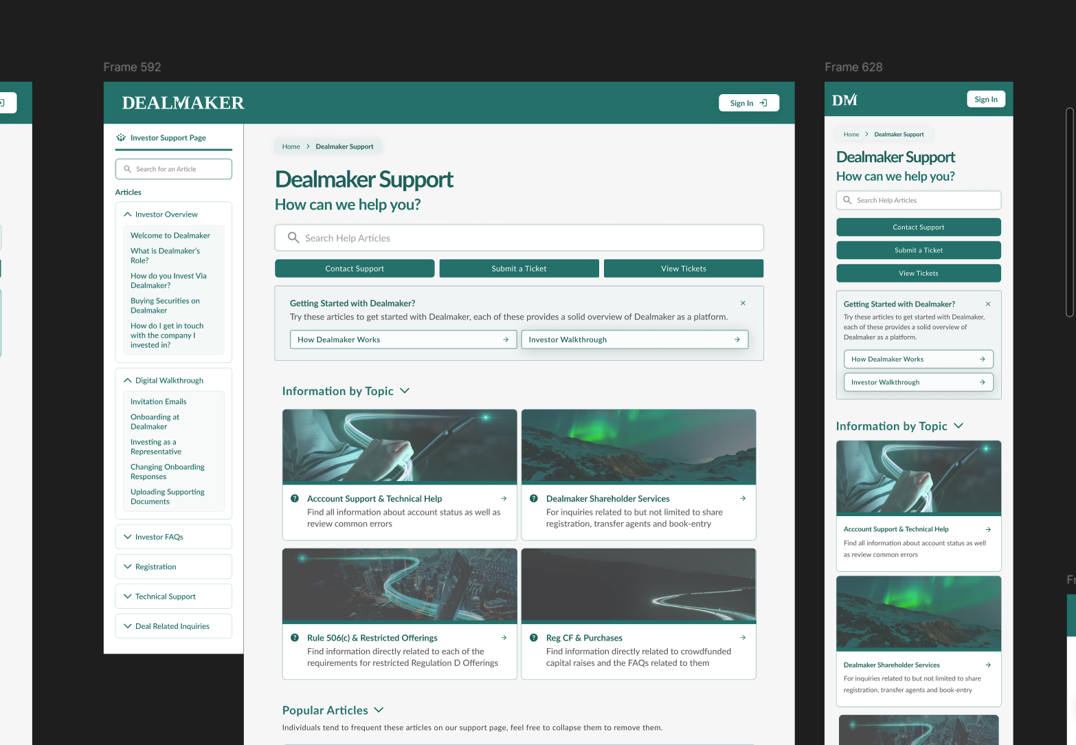
I was quite happy with the current look of the wireframe, but I wanted to see how it looked in a bit more higher fidelity. As this format had made improvements on the previous by the creation of things like the sidebar borrowed from documentation as well as improving the area for context as well as CTAs for the user.
Mock-ups
Prototypes and Refinement
High Fidelity Drafts
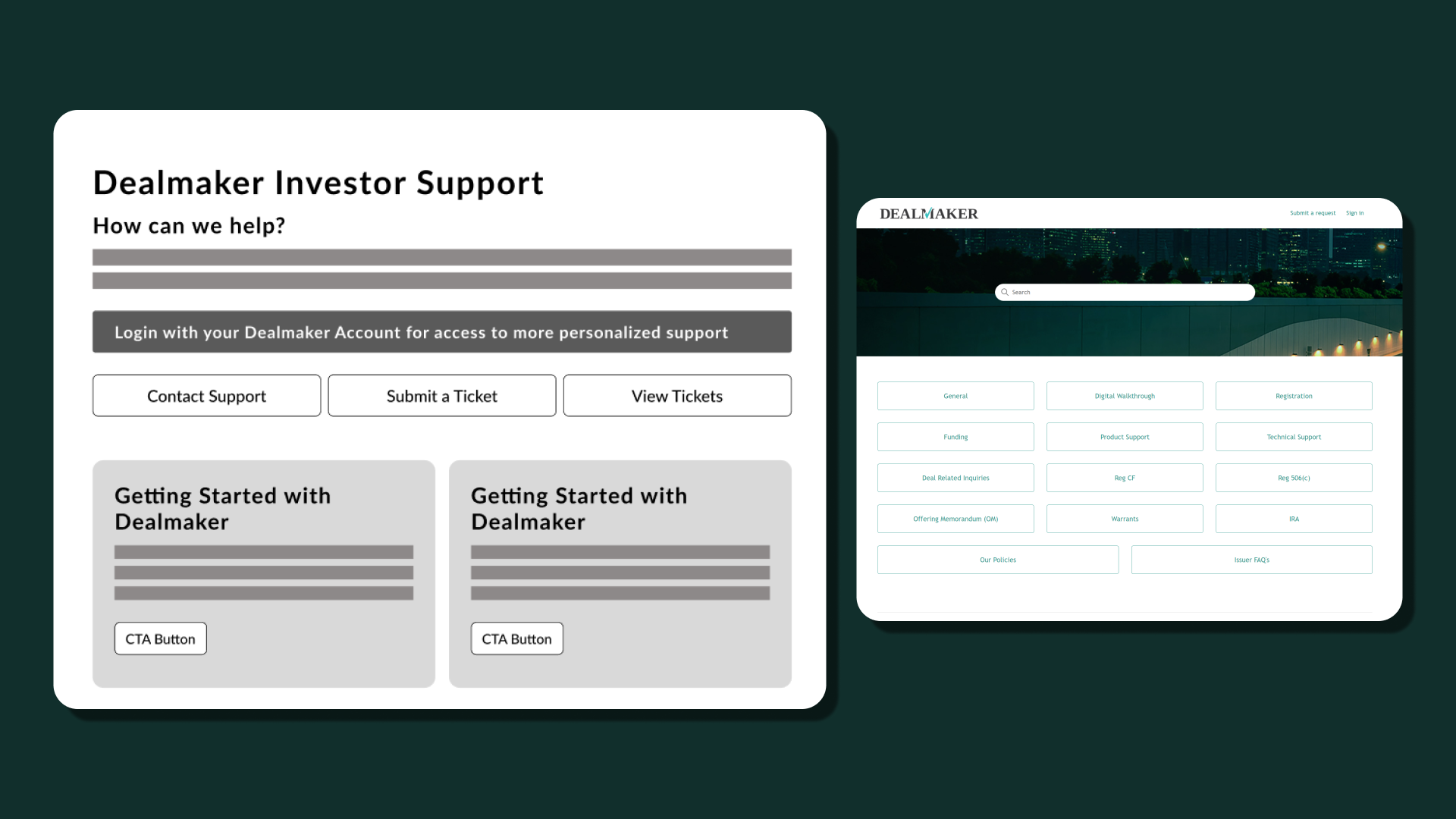
For the first version of the high fidelity drafts, the problem that I ran into was spacing & color. Initially, I had used the colours like the off-white to enhance readability. However when asking for some feedback, I heard the dreaded words, the colour choice looked dated... rather than a more readable professional look 🤦🏾♂️
Off White
color: #FFFFF0;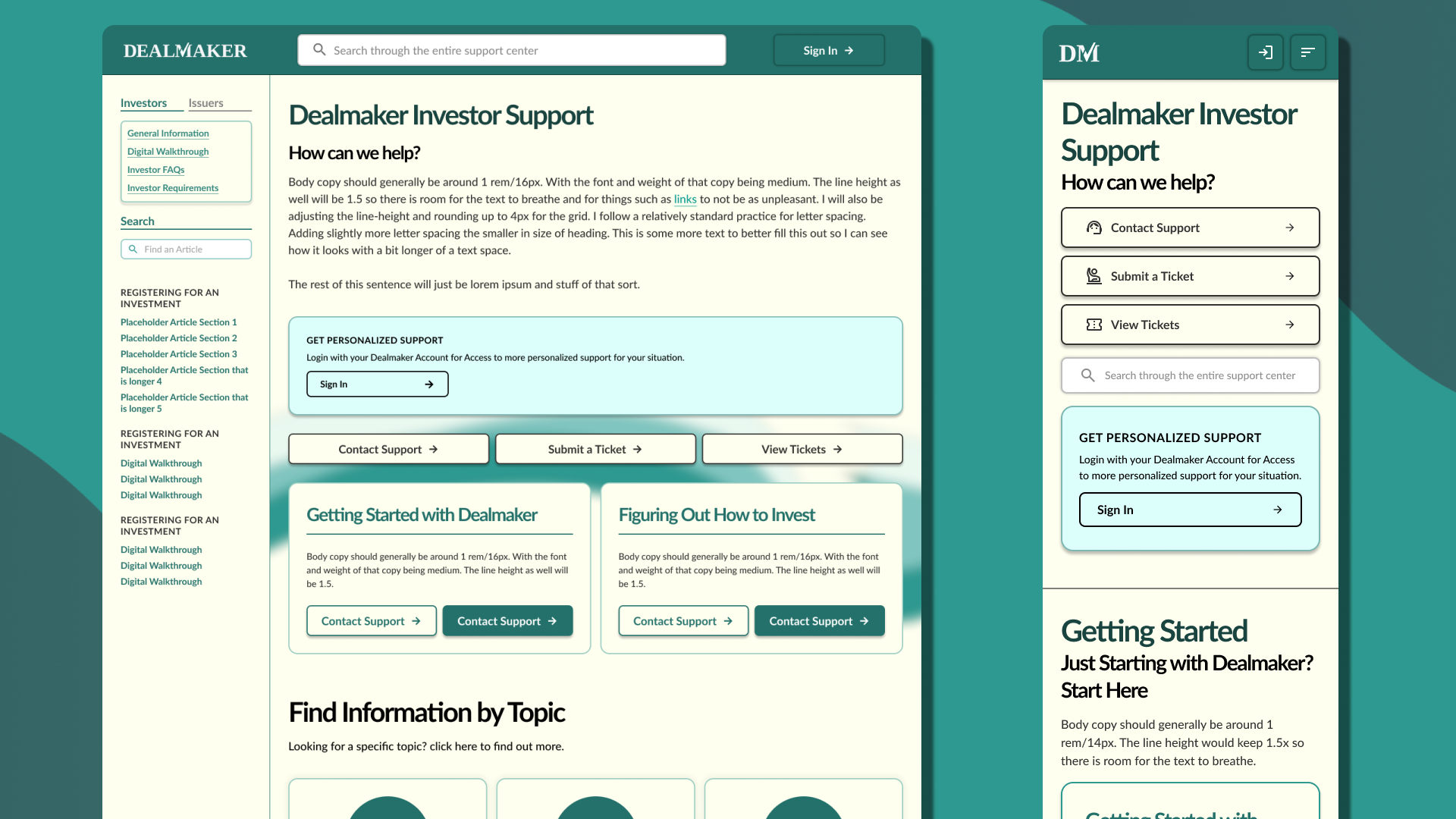 When looking back on this version, the usage of colour was unideal, and the gradients don't do the brand justice.
 As I was working from scratch here for the challenge, I had to work on all the small inconsistencies and improve my usage of text & space.
 An early version of the landing page where I attempted to add more definition to the landing page. In this version I had moved the offwhite for the sidebar as well as noticed some of the spacing problems at smaller widths like 1080px.
At this point, we've removed some of the excess information provided and split it between the different elements and specific areas. We've also added an introductory callout, focused on maybe leading first time users to an appropriate place. For example, a user like Michelle or Alex might explore things like these to understand more on the process. Rather than blindly navigating the landing page.
 One of my problems here was consistency for the user actions. For example ensuring we keep similar functionality between desktop & mobile. As well as having it be cohesive.
I had gone through quite a lot of small improvements to the design. One of the things I should have done earlier was iron out a consistent component system. As design tokens alone weren't cutting it for the design consistency.
One of my problems here was consistency for the user actions. For example ensuring we keep similar functionality between desktop & mobile. As well as having it be cohesive.
I had gone through quite a lot of small improvements to the design. One of the things I should have done earlier was iron out a consistent component system. As design tokens alone weren't cutting it for the design consistency.
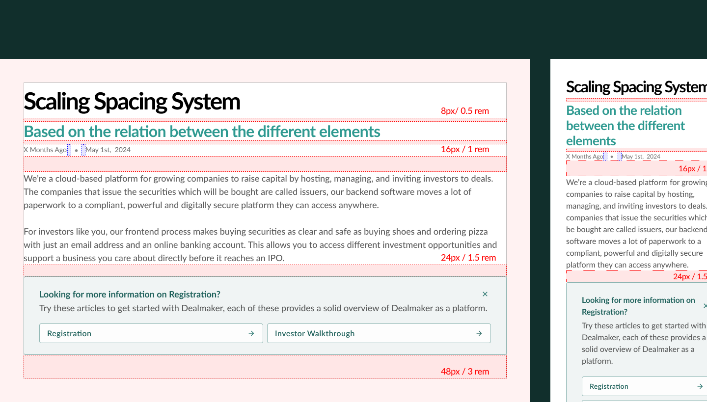
You might notice how the spacing changes, one of the mistakes I had made was not identifying a robust layout prior. I had been slightly inconsistent with how I worked with the spacing system. However, I landed on using a relationbased spacing system. I designed with a standard spacing system in mind, the one we can use is based on strong & weak relation to the content.
 At this point we had cleaned up a lot of the different inconsistencies. But we still have to
I had also done some content grouping as well and tried to group the various articles together under common groupings to lower the amount of searching for the user and decrease the time spent in user flow.
With this design and the consistent improvements, we're getting closer to the final designs. Realistically if this was a true project, this section might be more related to feedback and taking in stakeholder opinions in regards to distinct design changes.
Final Designs & Handoff
How does it look?
After improving the design and distilling everything down I would work towards ensuring a smooth handoff. This is a little bit of a sneak peak as to how I would handle this or try to.
ColoursBlack
color: black;Grey
color: #333333;Secondary Grey
color: #808080;White
color: white;Primary Brand
color: #23716b;Brand Accent
color: #2E9990;Tertiary Brand
color: #184e48;I began to convert the colours into things such as rgba values to make it easier to manipulate and work with.
/*Base Colors*/
--primary-color:rgba(35, 113, 107, 1);
--secondary-color:rgba(46, 153, 144, 1);
--tertiary-color:rgba(24, 78, 72, 1);
--primary-text:rgba(51, 51, 51, 1);
--secondary-text:rgba(128, 128, 128, 1);
ABCDEFGHIJKLMNOPQRSTUV
abcdefghijklmnopqrstuvwxyz
/*Base Font Family*/
--ff-base:'Lato', sans-serif;

/*Base Font Size*/
root::{
    --root-font-size:1.125rem;
    --mobile-downsize:0.8;
}


/*We can do calcs to keep this more scalable*/
--font-xs:calc(0.75 * var(--root-font-size));
/*or choose distinct sizes*/
--text-base:1.125rem;

/*As well as potentially implement media queries to handle views*/
@media (max-width: var(--chosen-dimensions)) {
    root:: {
        --root-font-size:1rem;
    }
}
We're going to be placing items with a higher relationship closer together. Where the margin also originates from the larger element. For example, our Display header will be more closely related to the Subheader than the body text. This is to help us create a spacial hierarchy
/*Base Spacing*/
--spacing-xs:0.25rem;
--spacing-s:0.5rem;
--spacing-m:1rem;
--spacing-L:1.5rem;
--spacing-XL:3rem;
 I designed with a standard spacing system in mind, the one we can use is based on strong & weak relation to the content.
Here i'd also explain my process for the macro layout and expand on it a bit more. My goal with these handoffs is to make it as seemless as possible. Such that it could potentially improve the launch speed of a product.
/*Macro Layout*/
/* We could solve this with a flex or grid, but I chose grid here*/
.main-content {
    display:grid;
    grid-template-columns:auto 1fr auto;
    grid-template-areas:
    "sidebar content inpage_nav"
}

.main-content > article {
    grid-area: content;
}


.sidebar {
    grid-area: sidebar;
}

/* If we were building with mobile first in mind*/
/* we might even use media queries this way*/


@media (min-width:768px) {
    .main-content {
        display:grid;
        grid-template-columns: auto 1fr auto;
    }
}

/* set up some sort of container sizing if preferred */
/* Up to the teams discretion and preference */
.main__container {
    container-type:inline-size;
}

@container (min-width:768px) {
    .main_content {
        display:grid;
        grid-template-columns: auto 1fr auto;
    }
}
Reflection & Final Thoughts
What do I think about this now?
This case study explores my process in redesigning the user interface (UI) and structural design of the support page for Dealmaker, a challenge that demonstrated my design capabilities but also led to my hiring at the company.