 This case is a living document and under construction.
Introduction
Story & Why Even..?
As a relatively unemployed product designer as of May 2024, I've had to get pretty creative with my spending over the past few years. With the prices of everyday items skyrocketing year after year, it feels like my dollar doesn’t stretch nearly as far as it used to. So, I decided to tackle one of the most ✨frustrating✨ and frankly ✨ridiculous✨ challenges of this inflationary mess.
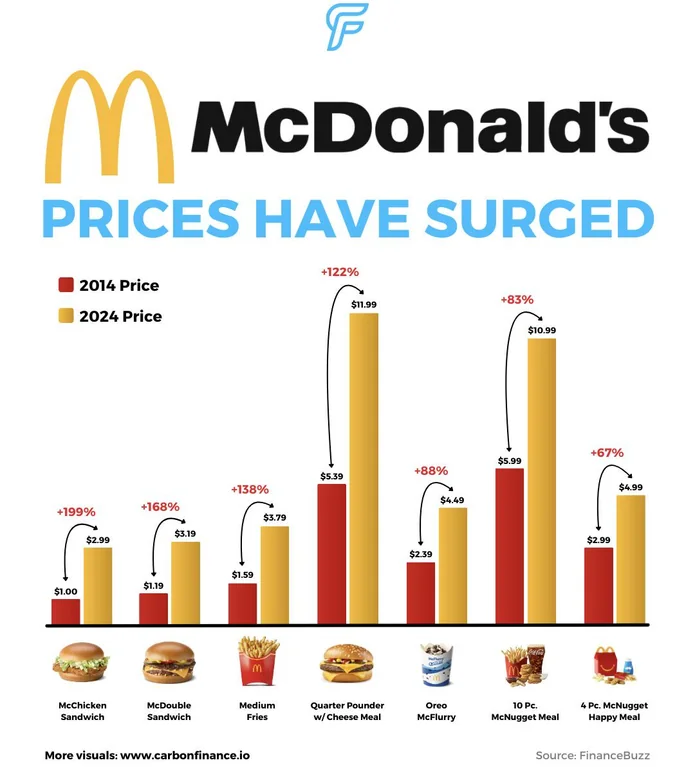

Recently, I had gone to McDonalds and realized I had spent over $10 on just 2 Junior Chickens, some fries and a large Sprite. I don’t know if this makes me sound like someone talking about 5 cent Coca Cola, but I remember in high school, handing a $5 bill to a friend at lunch and getting back two Junior Chickens (McChicken for my American friends) and a large drink. I sat there in McParking Spot #2, waiting for my Junior Chickens in the drive-thru, pondering the price increase and the “good old days” prior to tax returns, while ignoring the engine light, as you're supposed to do.
As anybody unemployed with too much time would, I leaned into this problem. As I primarily enjoyed the utility that came from knowing I was getting the most bang for my buck at fast food places growing up low income in a rich neighborhood.
I decided to do a bit of research behind the numbers.
Junior Chicken Price Changes vs. CPI, Minimum Wage and Inflation
(2015-2015 Indexed)I’m not really an economist, but my McDonald’s napkin math doesn’t really add up. Especially when comparing the items to This made me think about the current prices of fast food across the board. It's not just McDonalds and the value menu rising, it's across the board. Even the Burger King himself couldn’t even keep prices starting at $1.99 eventually landing at $3.89 for their value menu chicken item, although having a lower change. Even A&Ws followed a comparable path to BK, however sharply increasing in 2024.
Comparable Chicken Item Price Changes vs. Minimum Wage, and Inflation
(2015-2015 Indexed)Now fueled by the data and buyer’s remorse, I began to think of ways to identify these changes better or track them. However, there is no one true source. Some of these companies apply variable pricing to the different items they serve making it hard to track over time. Furthermore, the existing solutions for Canadians to find prices historically tend to be WordPress pages only updated for the current year, meaning that individuals are only able to really search for the most recent years without using a large amount of effort or leveraging tools like generative AI.
Discovery & The First Version
What did I do to start this off?
Diving in Head first
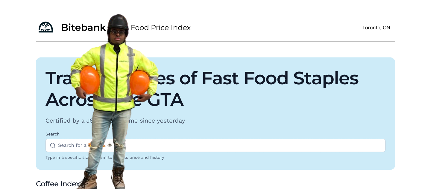
I initially started this project by diving into the mock-ups. I was excited, and wanted to use this as an opportunity to show off my great data visualization skills and fast food expertise. After spending the afternoon downloading a problematic number of snack photos I ended up with something like this.
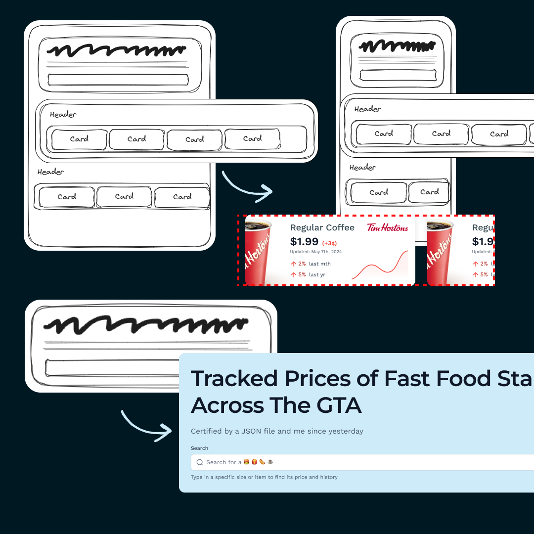 I tried my best to end up building for mobile scaling in mind with the carousel as well as adding the ability to search through the items.
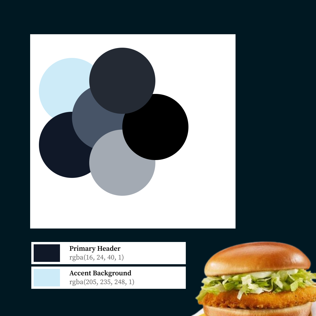
The style of the design as well as colour choice focused on lighter versions of blue. Because I thought it'd help contrast against the colours of the burgers or items. As well as potentially give a feeling of authority or security.
 The colours of fast food more often than not, end up on completely opposing ends of the spectrum. Which helps the look
 This came with the functionality of providing a nice central look at a few of the different items available at different retailers.
Building a Prototype
As anyone excited to learn something new usually does, they get in over their head and underestimate the outcome. Its how we as humans sometimes delude ourselves into making the impossible possible. Here, I was using that human ingenuity to focus on some of the things that hadn't mattered such as the data pipeline & how exactly to pipe in images. When I'd be sure to run into a bigger problems down the road.
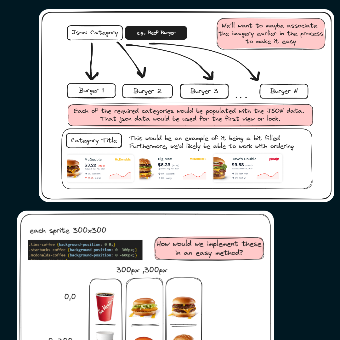 I learned a thing or two about sprites, and how to manage them with JSON here as I worked through the data.
As I prefer to stay in the safe haven of my HTML & CSS, this was my first react project in a while. I eventually got things running, but had run into a problem. I was directly manipulating the DOM, instead of taking advantage of things like data maps. What this means is, I was one by one allocating cards and giving them IDs over just populating the data easily.
Purpose & Data
Who is this providing utility to and what is that utility?
the product had a problem
The data is boring in current state, and the charts just like costs only go up 📈
As you can see above, the charts followed a relatively baseline format. Even prior to adjusting for styling. There would really be no insight gained from the components on the page. Furthermore, when looking for feedback the results were mixed. Which made sense, the product was relying on aesthetic usability as a crutch.

A lot of the positive commentary came from the comparison to current alternatives or lack of ones that might be a bit more intuitive to use. But the current mocks & ideas are lacking the functionality to satisfy a potential user.
Furthermore, I was beginning to remove my blinders and notice red flags that could throw a wrench in the methodology. Such as variable pricing, which was one of the reason I lowered the scope to a local basis. Again, although it was local this doesn't satisfy the users needs.

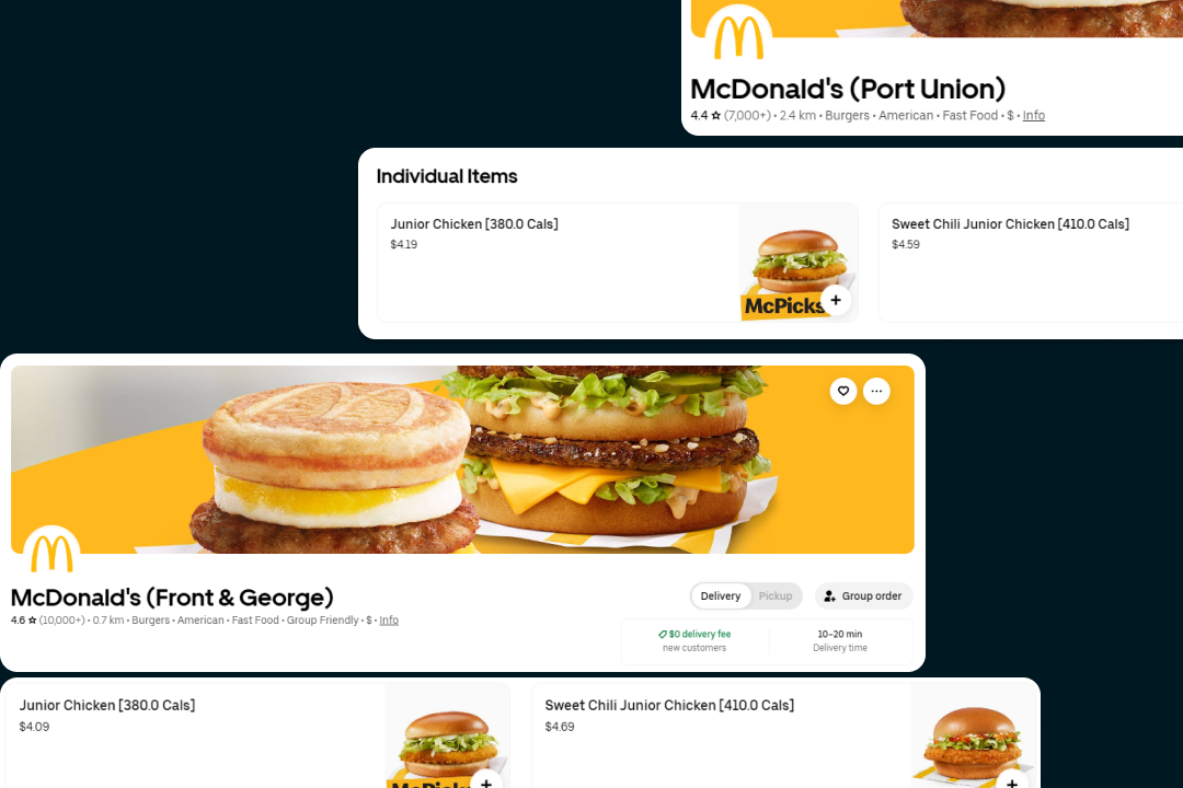 If we look through our example of McDonald’s via something like Uber Eats you can see variable pricing.
 I was really thinking through the total process, as I got in feedback. One of my biggest problems is data quality & sourcing for something of this sort. I had to find a new solution.
Currently working on parts following this, if you'd like more of a live update feel free to contact me.
Who are the users?

Fast Food Enjoyer 🍔
Looking for the Utility